In Borders Books, they have these neat “Title Sleuth” workstations. You are supposed to use these for looking up your books. The UI for the workstations isn’t particularly good, but what always gets my goat is this:
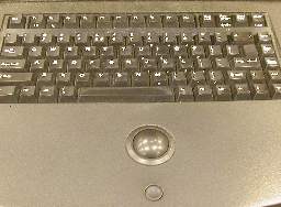
Note the teensy-weensy little left-click button. There is no right-click, which is OK. This is a “kiosk” system, so they want users to follow a custom navigation that the kiosk controls. Here’s the problem: The kiosk doesn’t know whether or not it’s a computer.
What do I mean by that? Well, the program that controls the display is a custom Microsoft Windows NT-based system. This is fairly typical of POS (Point Of Sale, not the…other…acronym) systems. The UI (User Interface) for the system is fairly standard Windows NT. The screen is pretty high-resolution, so it’s fairly large. It’s not a touchscreen, and even if it was, I wouldn’t use it. In any case, standard Windows UI is no good for touchscreen. The controls are far too small. You need to customize them for touchscreen applications.
Obviously, the designers want you to use the keyboard for everything. It does work. The problem, though, is that there are a couple of dozen fields on the screen at any one time. When you get search results, you have long list of clickable links. You really need to move the cursor to places and click. I think it is safe to assume that the kiosk was designed with cursor movement in mind. If that is the case, why is the damn mouse button so small?
 I’m not particularly fond of trackballs as pointing devices, but I can accept them. However, that teensy-weensy little Smartie-candy mouse button is awful. In most stores that I have visited, the button is not particularly functional, and you have to click on it fairly decisively in order to trigger it. That is a real face plant right there. You need to “wake up” just a bit in order to select a field. The concave design of the button aggravates this condition, as it is so deep that you may think the button has been pressed enough to work, when it has not been pressed far enough.
The button is absolutely necessary for operation of the kiosk, yet has been made so small that it is non-intuitive, and hard to use.
The concave design of the button is too deep. The button is recessed into the counter top, so you need to press into the counter top, but the concavity in the top of the button makes this difficult. Basically, it is hard to click on things.
Suggested Solutions:
Make the mouse button larger.
Make the mouse button rise above the counter top slightly, and reduce the concavity.
I’m pretty sure the designers deliberately deprecated the mouse button because it was always accidentally being pressed. This would take some testing to get an acceptable shape.
Redesign the UI to eliminate the need for a mouse, and remove the pointing device.
Okay, I don’t like touchscreens, but that would be better than this.