I wanted to have phones throughout the house that could be used as an intercom, as well as a way to deploy phones into places where there was no wiring for phones. I checked around, and found that the 2.4 GHz system from GE seemed to have all the right buzzwords.

The phones do everything they are supposed to do. I don’t especially regret getting them, but that is only because they were substantially cheaper than the other phone systems with the same features. Price was one of my principal factors. If I had paid more, I would have expected better design.
Their look is OK. The handsets fit into cradles for recharging. Many phones with recharging cradles make it easy to insert the phone so that the charging contacts don’t quite meet, yet the phone appears to be seated correctly. These phones don’t have that problem. You just plonk the handset down into its cradle, and the charging light comes up. I think that the keypad is too complex and badly designed, but that is par for the course for all of these types of phones nowadays.
The audio is clear and static-free. The range is fine for everywhere inside (and outside) my teensy little house. The intercom works fairly well, and I have the full complement of handsets (4). Each handset has a unique name that appears when using the intercom.
I have three complaints:
- When using the intercom feature, a loud, obnoxious beeping comes from the speaker on the other side of the earpiece. This beep is probably of a level high enough to cause hearing damage if listened to continuously.
- When an intercom is over, only one person should hang up. If both hang up, the second one to hang up actually takes their handset off the hook.
- The “Talk” button acts as both a “Talk” button and an “End” button.
These are all incredibly bad design mistakes, and result in severe face plants. I had no idea that the phones would have these failings, and they probably would have affected my purchase decision.
First, let’s address the beeping:
In order for an intercom to be effective, you need to have some way of getting attention. Usually, this is done via a ringer. Intercom-only devices tend to use the speaker, but people don’t usually hold those to their ears. These phones use the headset speaker (as I said, directly on the other side of the earpiece) to send out a loud beeping at maximum volume.
To add insult to injury, both headsets beep while paging. This has an interesting effect. You (the person initiating the page) can’t easily figure out when the person you are paging answers the phone, unless you hold your (loudly beeping) headset to your ear. When the other person picks up the page, the beeping stops. However, if you are not holding the headset to your ear (I recommend against holding the beeping headset against your ear for medical reasons.), then you won’t hear exactly when the other person picks up. You need to wait a half second or so for the beeping to stop, and then spend a second or so bringing the headset to your ear. This results in an awkward pause at the beginning of each intercom session.
Next, the annoying problem of hangups (and pickups):
We’ll start with Gripe #3: the fact that the “Talk” button is both pickup and hangup. This will segue into Gripe #2, and help to frame the issue more clearly.
Almost every phone on Earth has a separate button for “Talk” and “Hang Up.” There’s a reason for that: People think of them as two different operations, not as two different faces of the same operation. When I first got the phone, I suffered a MAJOR face plant as I tested the phone. I clicked on “Talk,” and got the expected dial tone. I then clicked on the button that, in every other phone I have, including cell phones, is the “Hang Up” button (usually called “End,” and clicking this button when the line is on the hook results in the phone hanging up. If it is pressed when the phone is already hung up, it either does nothing, or restores the phone to some default state). In the case of this phone, I was quite surprised to suddenly hear the dial tone blaring out of the speaker on the back of the phone. I looked at the keypad, and saw that the right-hand button was labeled “SPKR.” Silly me, I accidentally activated the speaker instead of hanging up. I guess you need to click on the “Talk” button to hang up.
Okay, so I click on “Talk.” The speaker shuts up. However, I still can hear a dial tone. What’s happening? The phone is now in normal “Talk” mode. Clicking on “Talk” simply kept the phone off the hook, and switched the audio to normal headset mode. Oh, darn! I’d better hit “SPKR” to hang up! I click on that button, and I am, once again, graced with an extra-loud dial tone, coming from the speaker. I hit “SPKR” again, and the phone finally hangs up. Through trial and error, I learned that you need to press the button that corresponds to the mode in which the phone is currently operating to hang up. It makes sense, technically, but is completely unintuitive. This is a “poster child” for the concept of a “face plant.”
This was a conscious decision. I guess that they decided that the speakerphone capability was one of the “core features” of the handset, and gave up one of the “prime real estate” buttons for it. I don’t think it was a particularly correct decision. A lot of bad came about as a result of this one decision.
Now, to Gripe #2. When you intercom someone, they pick up their handset, and press their “Talk” button. Their handset stops beeping. They then put the handset to their ear, and hear…nothing. This is because of that awkward pause I mentioned. After you realize they have picked up, you talk with them, and then, it comes time to hang up.
There lies the rub.
Whomever hangs up first actually hangs up their handset, and ends the intercom session. Remember how they do that? That’s right. They press the “Talk” button.
Say the person on the other end hangs up first. You then hang up, because that’s only natural. Remember how you do that? That’s right. You press the “Talk” button.
Remember Gripe #3? That’s where I complain that the “Talk” button is used to do both picking up and hanging up.
Now, you are hanging up. Except that the person on the other end already hung up, so your phone is hung up. You press the “Talk” button. Guess what? You just took the phone off the hook. If, as I do, you keep the handset in a pocket, or on the table near you, instead of returning it to the charging cradle, you will put the phone down, with the line off the hook. You’ll figure it out as soon as the “off the hook” alarm goes of in a minute or so.
This has resulted in an impromptu protocol. When we intercom, we end the conversation by agreeing who hangs up.
Now, that is lame.
Face Plant:
The one single design decision to make the “Talk” button act as both a “pick up” and “hang up” button, caused the worst face plant I’ve experienced in a long time. That whole “trying to hang up the %$#@!!! phone” ordeal. This also has forced our family to develop an annoying “protocol” to what is supposed to be a simple conversation.
The fact that the initiating handset beeps during an intercom call causes a real bit of awkwardness in a simple intercom.
Suggested Solutions:
Have the “SPKR” button moved to a less prominent place, and replace that button with an “End” button.
True, if you wanted to promote the speakerphone as a “core feature,” this would scrag that, but I think it would be well worth it.
Have the recipient of an intercom call beep loudly, and have the initiator beep softly, or flash the display backlight.
This would make the phone’s intercom feature (one of the principal reasons I purchased the system) far more usable.
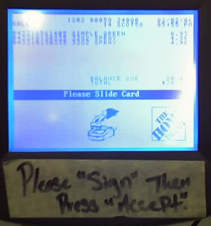 I was shopping in a self-checkout at a Home Depot, when I accidentally entered Spanish Language Mode. I think the software had a bug, in that the button “hot spots” were too wide. Apparently, this was a pretty big problem, as this sign shows (The “Accept” button was near the “Spanish” button):
 The drawer has its handle on the top, as opposed to the bottom. This results in two face plants. The first is that we usually expect the handle (the opening affordance) to be on the bottom of the drawer. Since the groove is hidden when the drawer is closed, I did not see it until after I had tried to grip the drawer on the bottom. The second is that you need to press down in order to open the drawer. This causes it to press harder into the rails, and makes it more difficult to open.

 When they designed the parking lot, they underestimated the turning radius of the trucks, so the trucks are forced to go over the curb on the edge of the parking lot. This tears up the landscaping something fierce. After a good rain, the berm looks like a World War One battlefield (minus all the bodies). Those truck tires, and all that weight, are absolutely brutal. The problem, from this amatuer’s eye, seems to be that lampost island in the middle of the parking lot. It stands between the truck and the exit. It was obviously put there as part of a pattern. Maybe they were required to have these lights exactly that far apart by code, or maybe it was just a question of aesthetics. In either case, that torn-up grass is very ugly indeed.
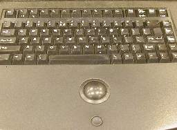
 I’m not particularly fond of trackballs as pointing devices, but I can accept them. However, that teensy-weensy little Smartie-candy mouse button is awful. In most stores that I have visited, the button is not particularly functional, and you have to click on it fairly decisively in order to trigger it. That is a real face plant right there. You need to “wake up” just a bit in order to select a field. The concave design of the button aggravates this condition, as it is so deep that you may think the button has been pressed enough to work, when it has not been pressed far enough.